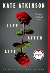
I Just Read: Life After Life

Life After LifeSnow. Darkness falls. Snow. Darkness falls. If you’ve read Kate Atkinson’s Life After Life, those words probably make you think of dead kids, and you probably agree with me that Edwardian England was in sore need of a DFACS. The book’s heroine, Ursula, is killed and reborn several times while she’s an adolescent. Whoo-wee there’s some negligent parenting going on here! And when Ursula finally makes it to womanhood, that’s when the sexual assault and spousal abuse begins.

Sound brutal? Atkinson’s novel about reincarnation, fate, chance, and redemption often is brutal. And also fascinating. It’s a piece of onyx carved by a mad, ingenious sculptor. Turn the carved stone over and over—new facets catch the light, jagged razor-sharp edges leave impressions on your palms. This is what the book was like for me, as Atkinson continuously cycles through the milestones of Ursula life (and of England’s history from WWI through WWII). Occasionally I worried that this series of revisited/revised scenes would get monotonous. Each time I got to that point, Atkinson would deftly hew the script into some new bend of her labyrinth.

With each life, Ursula becomes wiser and more aware of he situation (if always just nebulously), and she evolves into a Valkyrie who—in the name of love—is ready to obliterate the whole of our world history and start the second half of the 20th century from scratch. When the novel ends (the cycle of Samsara doesn’t), Ursula is more like Franka Potente in Run Lola Run than Gwyneth Paltrow in Sliding Doors.

Stylistically, Atkinson strays far from standard writing format. She doesn’t use commas when she’s technically supposed to. She layers flashbacks over flashbacks over flashbacks, and loves to use asides nested in parentheses. (“Don’t use parentheses,” Strunk & White would say.) The plot often bleeds into cluster of two or three scenes striated together, which actually fits quite nicely with the central idea of the book. In Life After Life, time is not linear. It’s an onion. It’s a Moebius strip, a flat circle. (Cue Matthew McConaughey and a beer-can doll).

Highly recommended. The end. Darkness falls.
State of My Writing, Spring 2014

It’s time to dust off the portable hard drives and those nearly useless 16MB memory cards. Time to  email attachments to myself. Time to start stashing files in the cloud. It’s back-up time!

As of right now, I’ve finished the 4th (and hopefully final) major redux of TURNING and the 7th (and hopefully final) redux of IDYLL. Whew, what a relief! I started the first version of Idyll in February of 2006! The four main characters and the setting have remained mostly unchanged in eight years. Everything else has changed drastically and often. Right now I want to sit on both stories to plan a potential roll-out in late 2014, early 2015. This is because:

1) I’m skeered.
2) Both books are being reviewed by Beta-Readers
3) I want to absorb as much as I can on the subjects of publishing e-books, marketing e-books, building my platform, etc.
4) It’s a very busy time with my job and attempting to sell our house
5) I’m beta-reading my wife’s new WIP
6) I’m skeered.

And there’s another exciting reason! Only exciting to me probably! I’ve begun humping away on a sequel to Idyll! Three weeks ago, I was one paragraph away from finishing a final revision on a cool short story, when the urge to start on the sequel overtook me. For a long time, I’ve had a rough idea of where I wanted to take the characters in Idyll—their course for a second and third book. But in early May I began to really think about what would happen in Book 3 of the series. I think I came up with a great story—I can see the characters evolving to these great places, and now I can’t wait to write them.

Hopefully Idyll’s first sequel won’t take another eight years to complete. I think I can realistically shoot for eight months. Part of my plan of attack is a tactic I’m calling “gap writing.” I’ve heard in the past that as some writers go through their first draft, they’ll write as fluidly as they can, and leave blanks if they can’t come up with the perfect adjective, or if they don’t want to stop to look up a particular fact. I’m taking that rapid-burst technique a step further: sometimes I won’t even bother to write down proper names. I’m skipping straight to the verbs and their objects. We’ll see, as tactics go, if this is more of a Pickett’s Charge. So far, when I’m on a roll and really enjoying myself, the full sentences seem to flow unbidden from my keyboard. In fact after one particularly fleshed-out, detailed paragraph, I had to stop and remind myself that this is just a first draft, and everything I write could change, so I don’t want to spend too much time on it now. The goal is to end up with a intensely descriptive outline that lays out each chapter, clause-by-clause. Description…Action…Reaction…Description…Metaphor…Dialog…Action… All muscle and bone, but no sinew.

My hope is that I can have Book 2 finished so that it could drop 2-3 months after Idyll is released. That means I could have three novels and one short story on the market by March or April of next year! Of all the self-publishing advice I’ve read, the tip that makes the most sense to me is “Write, write, and write some more. Don’t stop with one book.” The most successful authors have multiple items on their Amazon author pages, so that they can leverage the success of one book to help boost the others.

Don’t You Roll Your Eyes at Me!

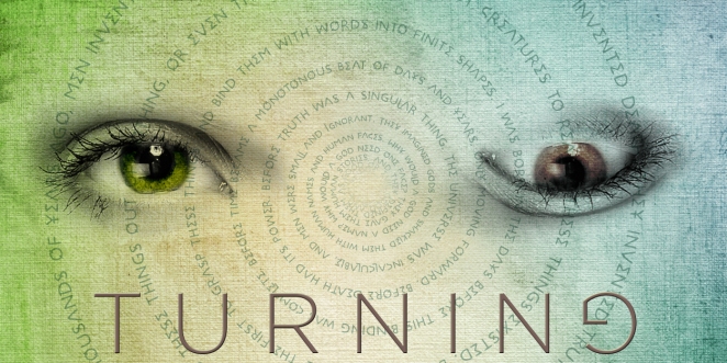
I’m currently querying for my paranormal novel, TURNING, (up to eight rejections so far!) and I started working on a promo image for the book. Here it is. I kind of like it.

Promo image for TURNING. My paranormal novel about reincarnation through possession.

Promo image for TURNING. My paranormal novel about reincarnation through possession.

Overall, the image reminds me of Junji Ito. Which in and of itself is a good thing; except that I’d prefer to think of TURNING as ‘paranormal’ and not ‘horror.’ And Junji Ito is very much ‘horror.’

It took a while browsing through stock photos to find a pair of eyes that worked as a pair once I flipped the left eye upside-down. I’m a little worried that the image looks more grotesque than eerie (eerie is what I was going for). But hopefully the spiral of text helps to convey the idea of   ‘juxtaposition’ as opposed to disfigurement! The text is part of an occult scripture in the book, so it was nice to get to use it here. I think the rough canvas background also helps to convey the idea of something ancient and possibly a little bit sinister. I picked the sea foam color because the story takes place on the coast, and I think it helps keep the image inviting.

Finally, there’s the Gotham font for the title. Gotham the official font of the Obama campaign and of most of Coke’s marketing. If you’ve seen a san-serif font on a print ad in the last six years, there’s a 50% chance it was Gotham. But there’s a reason Gotham’s so popular: it’s a damn good font, both for text and for headlines. I think it gives a clean, calm, inviting feel—as opposed to a font called Splatterpunk or the like. Also, it needed to have a nearly round ‘G’ for the rotated letter at the end. But maybe Futura would have been a little less cliched.

Please let me know what you think! And check out more info on the TURNING page. And read a Junji Ito book if you’re into comics!